The Chill Co.
Loud music. Louder opinions. A full brand identity for The Chill Collective: logo, mascot, colours, and typography, extended across a line of merch, ensuring ChillCo is ready to succeed from day one.
Website coming soon
The brand
Loud music. Louder opinions.
The ChillCo. is not a place you find, it finds you. Equal parts playlist and personality, this is where the good stuff happens between plans. Loud when it needs to be, easy when it doesn't. Show up, take a corner, and let the music do the rest.
My approach
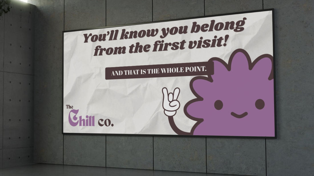
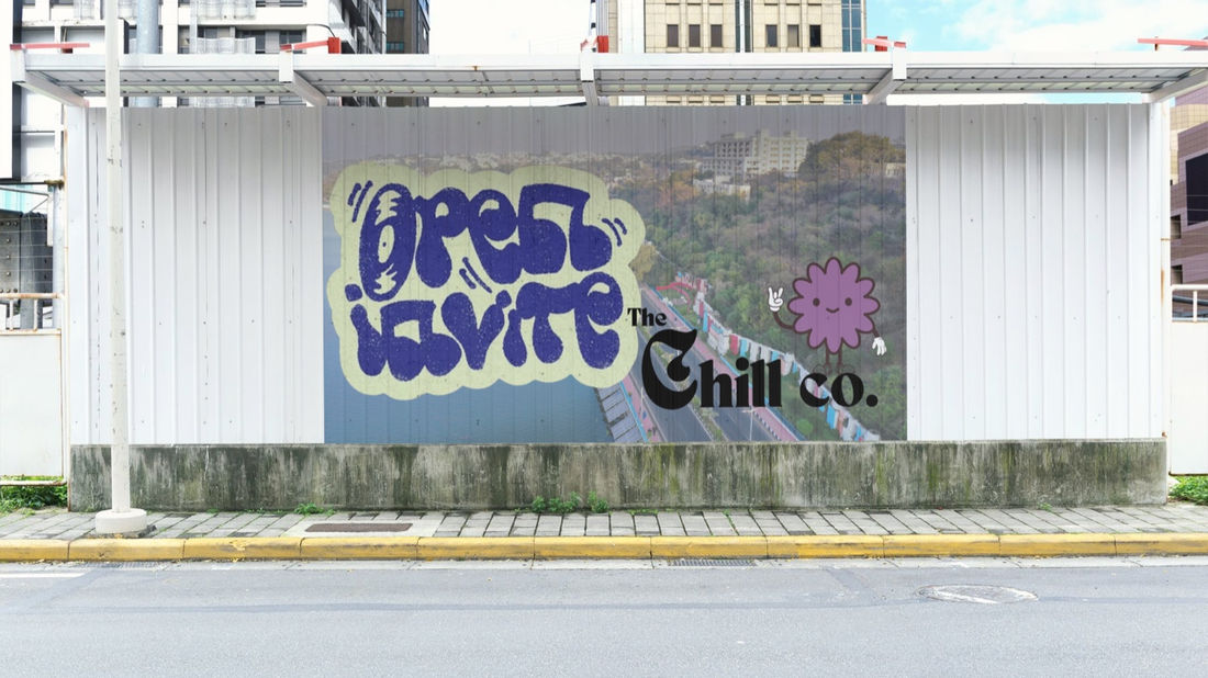
I built the identity around a character and a voice: a wordmark with a hand-drawn C, a mascot with a full range of moods, a warm two-colour palette, and patterns loose enough to go anywhere. Then I carried it across billboards, a street mural, and a line of merch.
Logo and mascot
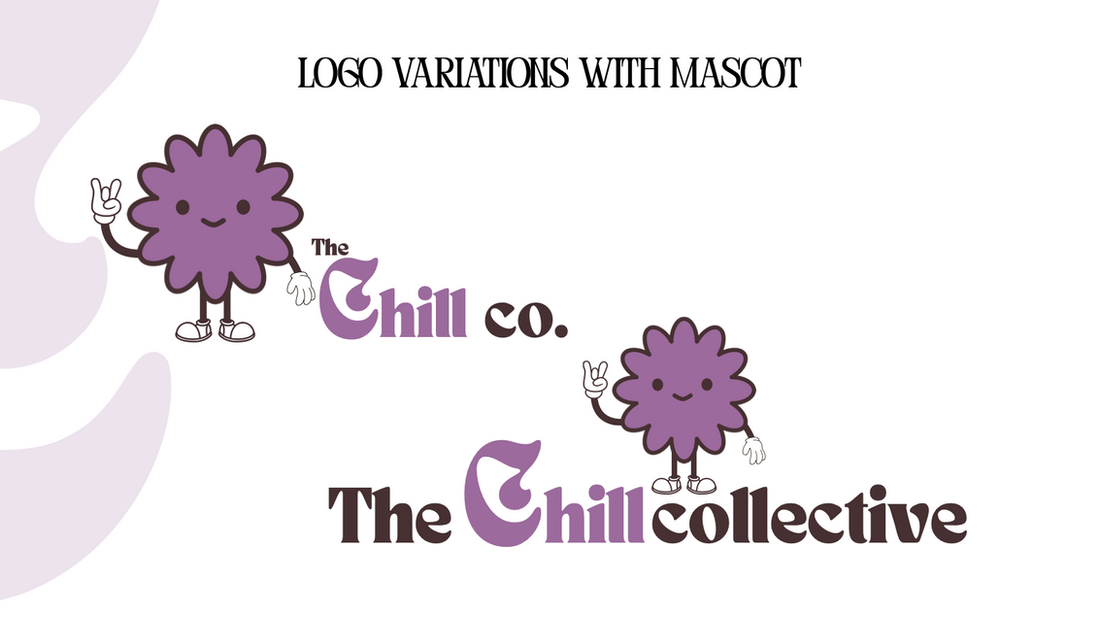
A wordmark with a curled, hand-drawn C, in two lockups: The Chill Co. and The Chill Collective. A scalloped purple mascot with six expressions gives the brand a face.
Colour and type
Gray Lavender and Dark Brown, with True Black and Eggshell White. The brand name is set in TAN Nimbus, headings in Abril Fatface, and body copy in Poppins.
Patterns and applications
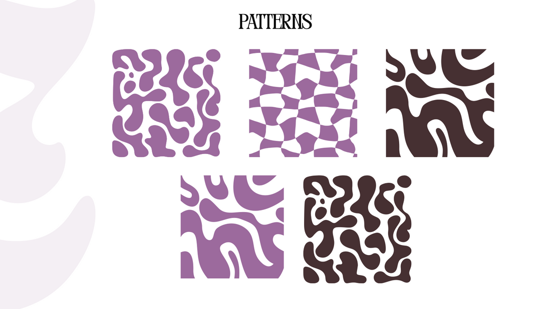
Five patterns of organic blobs and warped checks, applied to billboards, a street mural, T-shirts, caps, cushions, cups, bottles, and gift wrap.
Brand in action
Logo
The logo comes in two versions, The Chill Co. and The Chill Collective. Both are built around the same hand-drawn C in Gray Lavender, set against Dark Brown lettering.
Each version also has a lockup with the mascot, a scalloped purple character throwing a peace sign.

Mascot
The mascot has six face variations, from cheerful to unimpressed to fired up, so it can match the mood of whatever it sits on.
Colors
Four colours, each with a job to do:
- Gray Lavender sets a relaxed, playful mood.
- Dark Brown adds warmth and grounds the purple.
- True Black keeps text and outlines crisp.
- Eggshell White softens the palette so nothing feels harsh.

Typography
The brand name is written in TAN Nimbus. Headings use Abril Fatface; subheadings and paragraphs use Poppins.
Patterns
Five patterns in the brand colours: organic blobs, flowing shapes, and a warped check.


Out in the world

Merchandise


Want your business to perform like this?
Perfect Pitch
A Brand Identity case study
Read the case study →