Perfect Pitch
Sports arena where the game never stops and the energy never fades. Perfect Pitch is built for those who live and breathe sport. A full brand identity, logo, colours, and typography, extended across a line of merch.
Website coming soon
The brand
Game on
Where the game never stops and the energy never fades. Perfect Pitch is built for those who live and breathe sport, every corner designed to pull you in, every moment crafted to keep you here. From the roar of a last-minute goal to the quiet focus of a pre-match ritual, this is your arena. Come for the game. Stay for everything else.
My approach
I built the identity as one system that holds up everywhere, from a billboard to a water bottle: a logo and icon set, a four-colour palette, a type pairing, and a library of patterns. Then I carried it across launch billboards and a line of merch, so the arena looks like itself from day one.
Logo and icon
A figure in full stride, drawn in ribbon-like strokes of blue and orange, paired with a serif wordmark. Stacked and horizontal lockups, a standalone icon, and a circular icon for when a design needs symmetry.
Colour and type
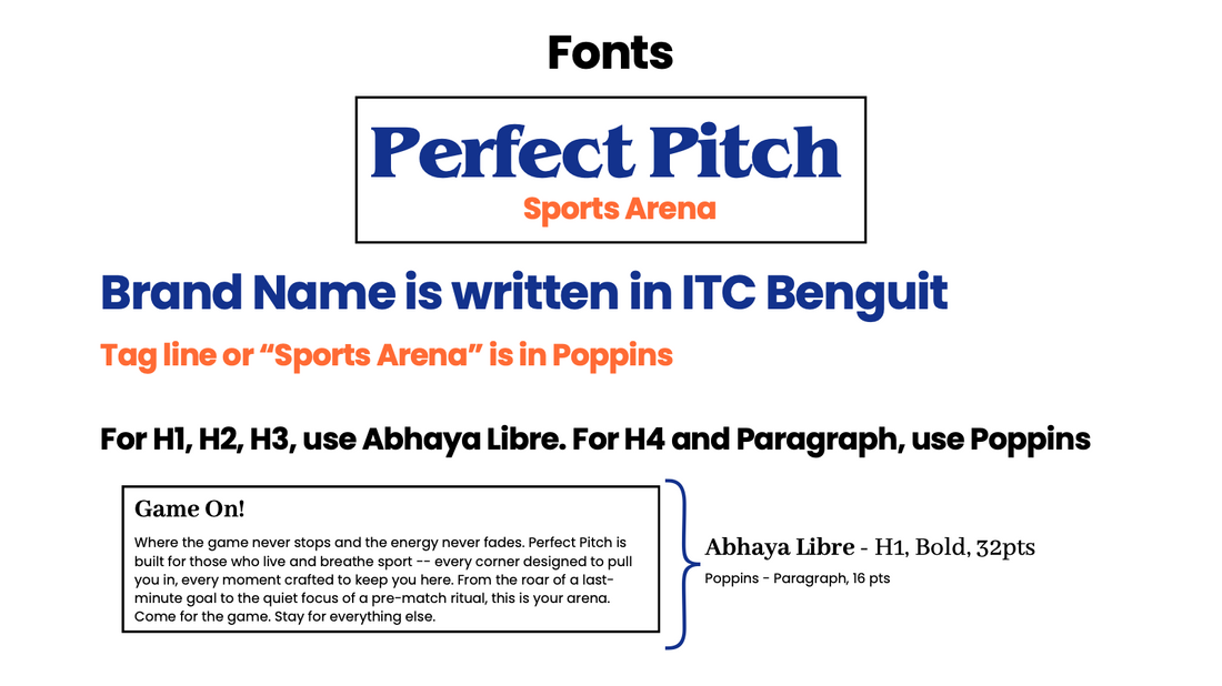
Sports Blue and Vivid Orange carry the energy; True Black and Off White keep it grounded. The brand name is set in ITC Benguiat, headings in Abhaya Libre, and the tagline and body copy in Poppins.
Patterns and applications
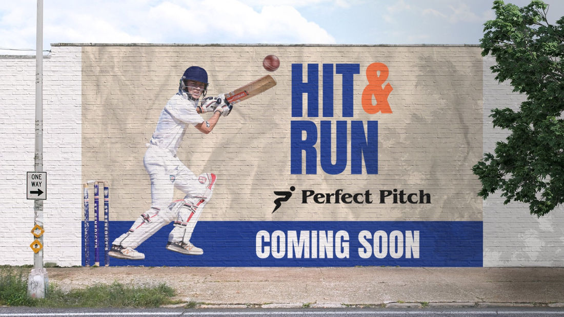
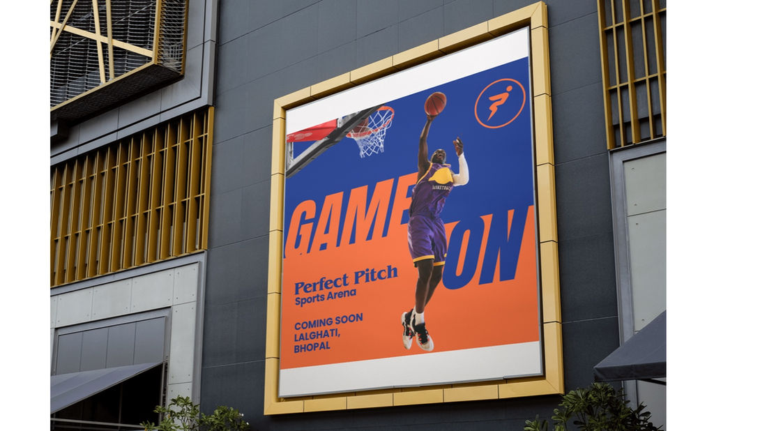
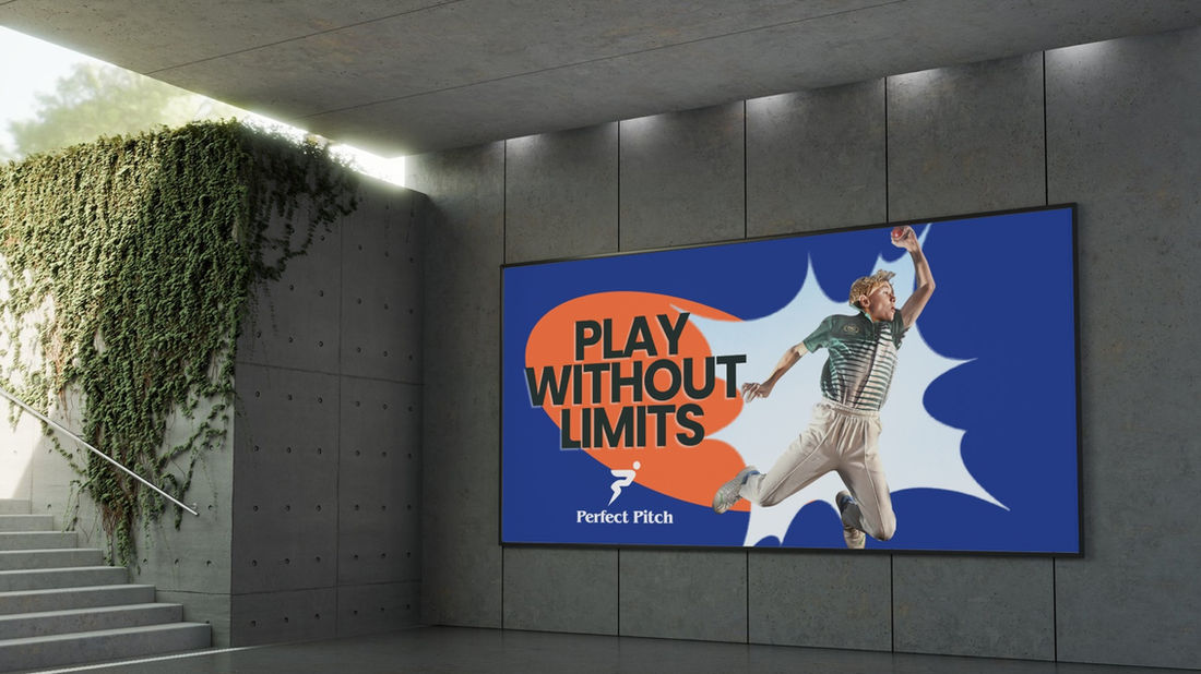
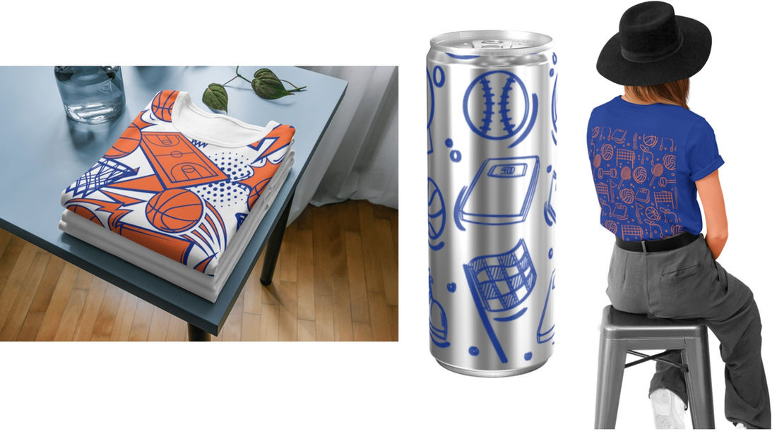
Logo repeats and hand-drawn sports doodles for packaging and backgrounds, applied to launch billboards, T-shirts, bottles, cans, and pouches.
Brand in action

Logo
The logomark is a figure mid-stride, built from two ribbons of colour with a circle for the head. It works in full colour, in a single colour, and inside a circle, and pairs with the Perfect Pitch wordmark and its Sports Arena tagline.
Logo icon
The main icon is used on light backgrounds and the secondary icon on dark backgrounds. Single-colour icons sit on the opposite colour background, and a circular icon is used when symmetry is needed in a design.

Colors
Four colours, each with a job to do:
- Sports Blue adds an electric vibe to the brand.
- Vivid Orange adds vibrance and a jolt of energy.
- True Black gives headlines weight and keeps everything readable.
- Off White gives the bold colours room to breathe.
Typography
The brand name is written in ITC Benguiat, and the Sports Arena tagline is in Poppins. Headings use Abhaya Libre; subheadings and paragraphs use Poppins.

Patterns
Patterns for use in packaging and backgrounds: two built from the logo icon, and two hand-drawn sets of sports gear, one in orange and one in blue.
Out in the world


Merchandise

Want your business to perform like this?
Coral Innovations
A branding, website, and SEO & GEO audit case study
Read the case study →